A note on the cover: The creative process is one that comes full circle. When Installation Magazine was first introduced to the world, we were in print. We were fortunate enough that Hugh Holland’s photograph “The Spectators” appeared on the cover. Several years ago, Mona Kuhn collaborated with The Billboard Creative and fell in love with Holland’s work just as we had. It was wonderful to see the image on such a large scale. Ironically the billboard appeared several blocks away from our first office, the site where the first issue “California” was written.
A brand has a life all its own. What originated as an abstract idea that filled notebooks and echoes of conversation that lasted well into the morning hours can become more concrete and can soon support itself. Like all creative pursuits, the creation of a brand isn’t born with a “just-add-water” osmosis but requires cultivation and thus it evolves organically. When Installation Magazine was first founded in 2012, our debut issue “California” appeared as a beautifully bound, glossy and printed magazine available in a limited run. Adhering to the traditions of print, the logo resembled more of a masthead that ran across the top quarter of the cover leaving as much space as possible for the cover image. The typography was selected for the interconnectivity of the letters and as a means for the name to be easily distinguished on a newsstand. We love print. We always have and always will. Maybe one day our content will appear in print again. But we saw an opportunity to enter the Apple App Store on the newly introduced iPad and iPhone with Retina display in early 2013. Soon after its introduction into the world, Installation Magazine evolved from glossy print to an entirely digital experience. While we were identified as the first all-digital Contemporary art publication, the few printed assets that we produced were of tremendous value as they communicated a digital entity into the physical world. MOO felt like a natural choice to produce our most prized printed asset- the business card. The Luxe line of cards was tantalizing and tactile as the paper felt heavy like letterpress. By including a black line the runs down the middle of the card, one card appears like two or three. The optical illusion proved to be a natural means of starting a conversation as the recipient almost always assumed they were mistakenly handed two cards. The vibrant colors also meant we wouldn’t easily get lost in the shuffle.
Installation began by publishing large special issues on the iPad that took months to produce and were filled with as many artists as we could find. Even though we had transitioned to the digital publishing space, the logo remained the same and we treated the frame of the iPad and iPhone as a magazine border.
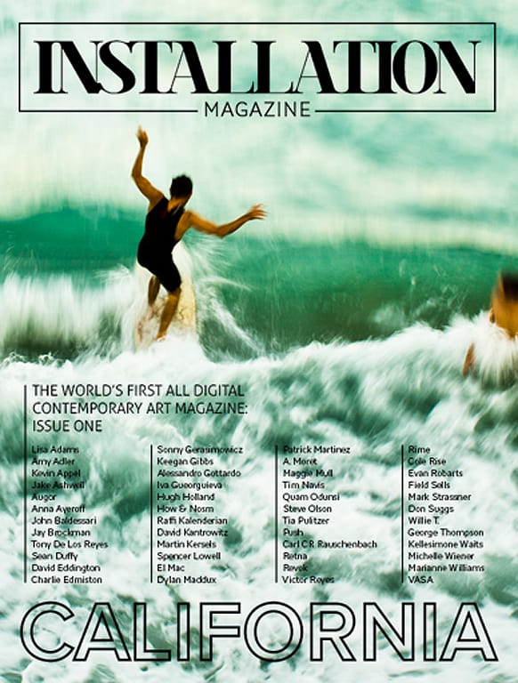
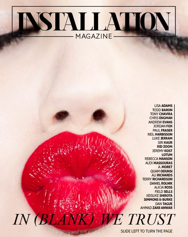
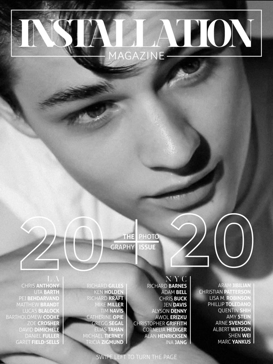
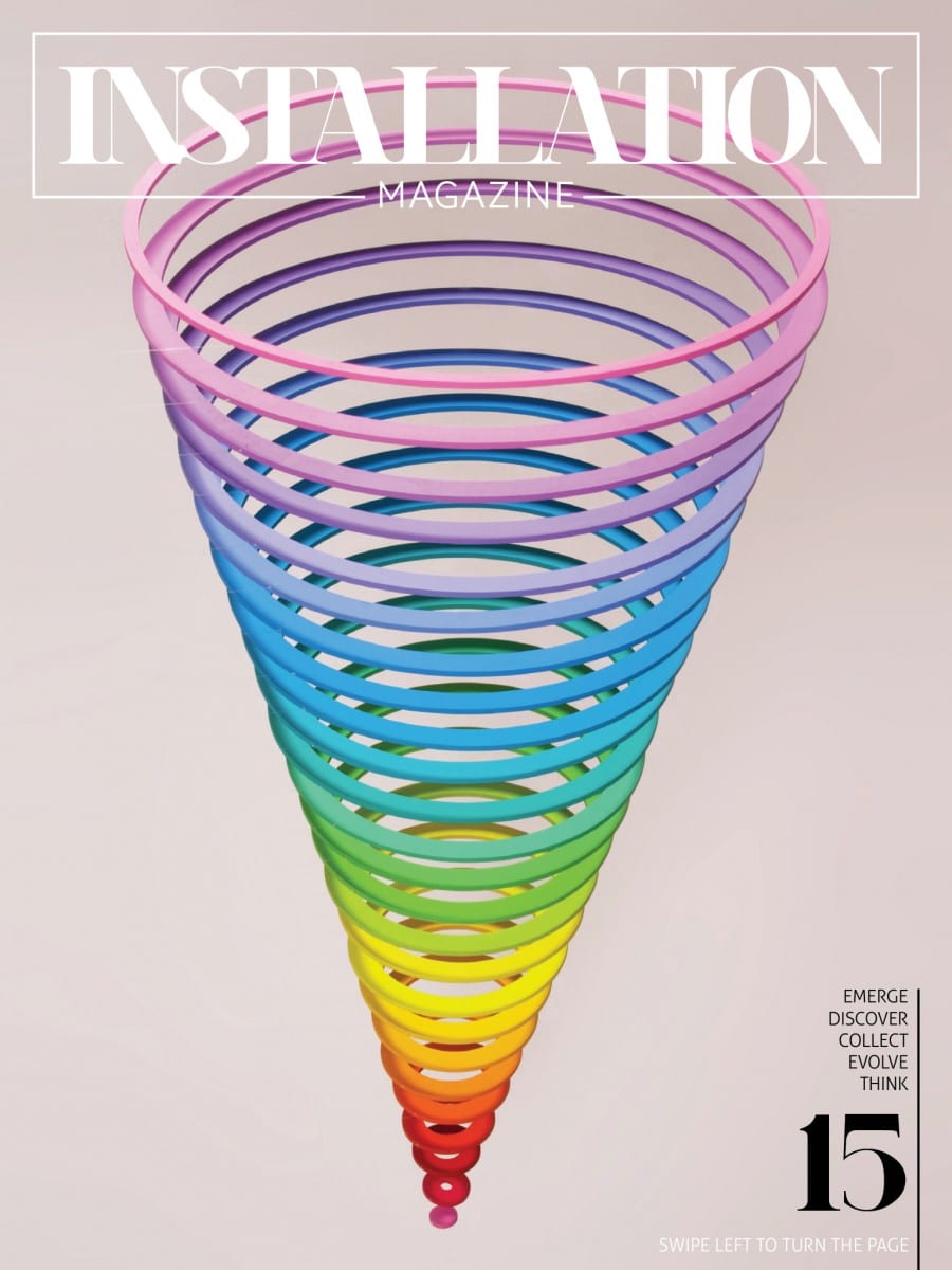
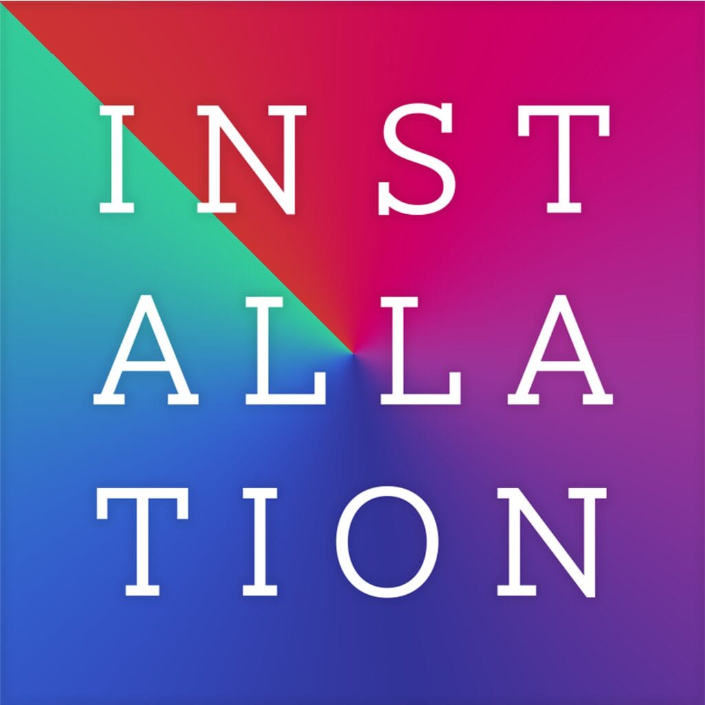
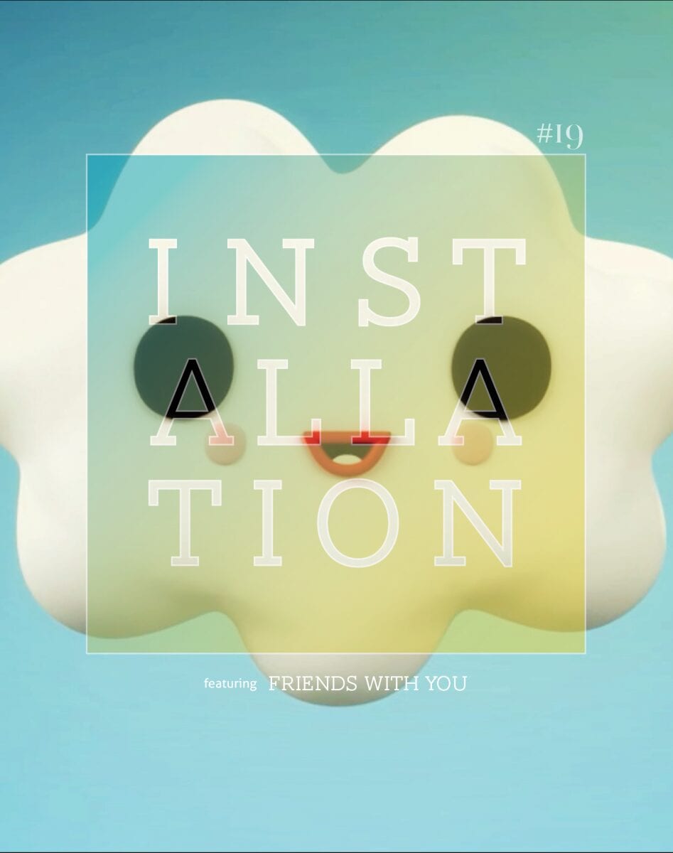
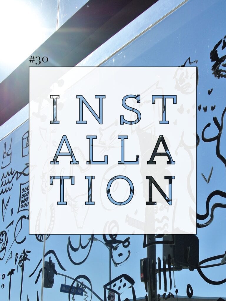
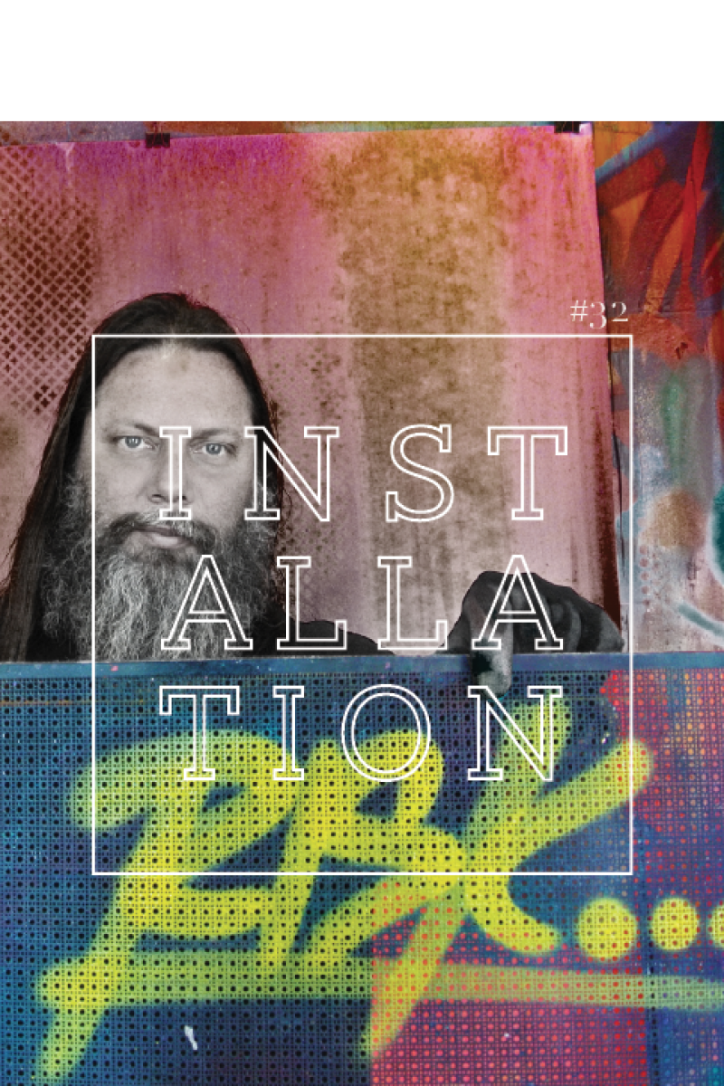
Soon, production went into overdrive. Readership organically grew and expanded internationally. The next development was the transition from quarterly to weekly. After fifteen weekly issues, we revisited our logo. No longer in print, why did our logo need to mimic print? Issues 16 and onward signaled a shift in identity for Installation that remains true to present day. Our name became a square with typography that accentuated the three punctuations in our name- Inst/alla/ tion. The color spectrum enlivened our namesake and signaled unity, exploration, and daring to be bold. Moreover, the conscious decision of the square was like a stamp, authorizing our approval of the contents of each issue and every project we took on. By the 16th weekly issue, “Installation” appeared layered on top of the cover art as the two were inextricably linked.
The magazine has allowed opportunities to curate large-scale immersive installations in Los Angeles and New York. Over the years we have worked with MOO to create flyers with our signature color gradient to present artist and curatorial statements. We have also created limited edition postcards signed and numbered by the artists as a collectible work of art for attendees. While we are digital and our brand is still evolving, we can never deny the impact and value of quality printed products that capture the spirit of who we are.
Installation Magazine has partnered with MOO to create this article.
